Tuesday, November 6, 2012

Off-line blog editors – a look at a few

Surprisingly Windows Live Writer 2012 came out on top as my
favoured off-line blog editor tool

For me, blogging (it’s really writing for that matter) comes down to a set of creative preferences.  The screen and keyboard are core to how productive I will feel in being able to convey and share information.  The keyboard is a very personal relationship we all develop with our kit and underpins our comfort of getting our thoughts out, given our experience with the old school keyboard and mouse combo.  As a relatively recent blogger, I’ve also found the software solution is just as important as my hardware preferences.

I created this blog on Google’s blogger platform primarily because it was relatively quick and painless in creating a name and applying a suitable template to get started.  Add Google’s data centre infrastructure in terms of high availability, reduced risk of data loss and globally large pipe access to ensure solid performance from most major locations, (regardless of traffic volumes) made it a much simpler to deal with and of course, free (subject to agreeing to terms and conditions with Google of course).  If you’re not into HTML coding, then you run up against challenges in altering the design as much as you would like.  That’s certainly an area I’ll look at when I have time.

In terms of editing blog posts, beyond using the web based editing tool for Blogger which is solid in terms of the ease of editing I require, my main hang up on it, is having to be on-line which is not always possible and sometimes not what I prefer.  I ended up looking at some Mac and PC client software to connect to my blog with the aim of providing me a rich editing experience while at the same time being a doddle to use with my favoured hardware combos.  So here is a short write up of 3 different solutions I’ve tried to date.

MarsEdit
Red Sweater’s MarsEdit software is the rated Mac Blogging solution featured the Mac Apps Store, and so despite its £30 price tag, I plumped for it thinking it would cover all of my basic off-line blogging and proofing needs.  Using a familiar UI in terms of side panes, inspector-like features and toolbars, the software provides a reasonable level of sophistication for off-line editing and posting back to my blog.  It does have one curious functional omission – advanced control of images inserted into posts.  I’ve found I cannot not easily change size, placement or add captions to my images inserted into posts, which is essential to my style of posting.  This is a deal breaker on the current v3.6 release.  I’ve since raised this with Red-Sweater software who envisage to add such functionality into a future release. 

In fairness, they did suggest a way around this by adding custom "Style Macros" in the Media Manager, the downside being it would hand-editing the HTML mark-up for the macros to (e.g. add desired margins to images I insert). Theoretically, once I have set them up I wouldn’t have to edit the HTML every time you added a photo (real meaning – some geeking and hacking I don’t have time for right now, but will come back to).

Blogsy
This is an iPad blog editor which supports a variety of blogging platforms, including Blogger and WordPress.  Surprisingly, the UI takes a bit of getting used and provides video and general off-line help in getting started and the usual how-to items.  While general text editing is reasonably okay within the confines of using an iOS on screen keyboard (real meaning – not comfortable), I came across frustrations when adding and editing images inside one post I was creating.  To be fair, I need to spend more time using Blogsy to form a more rounded opinion.  Initial impressions are I’ll use it and endure the learning curve if I have to, given a) blogging on an iOS device is still not natural to me and b) my favoured blogging set up involves my Lenovo PC keyboard (actually the SK-8825) and a 19-24 inch widescreen monitor which I have either in the work or home office.

Windows Live Writer 2012
Smacks of irony on this one.  Principally being firstly that I did not expect to find PC software to be what I found easiest to use and secondly, that it’s a free from the Windows 7 Live Essentials pack.  Given that I’ve been using MS Office all my working life and the ribbon is essentially ingrained in our daily usage habits, Live Writer certainly sets itself up as the the software client you will already know how to use.  It supports all the major blogging platforms, is straightforward to set up and connect to your blog.  When you get into just the writing, I found it’s replicated more than 80% of the required functionality I use on Blogger’s web based editing tool.  Image editing is fairly good in that it allows placement and sizing, although the downside is I have not found a way to adding captions to my images.  Like Mars Edit, most editing could be done in the off-line client, then uploaded in draft before top and tailing using the web editor.

Now wouldn’t it be something if I could access this rich functionality for off-line blogging on a Surface tablet running Windows 8 RT and found that the tablet itself, touch cover and RT software worked together beautifully? (i.e without a kludge desktop mode baked in).  Now that would be a hybrid tablet worth having Microsoft..

Friday, November 2, 2012

Brief looks with the iPad mini

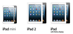
image
 
As it’s iPad mini launch today in multiple countries, this was my first opportunity to hold and use one in the flesh.  It’s  easy to have a mental idea of the mini from the numerous articles and reviews recently, but I must say I was surprised given the 10 minutes of playtime  I had on the device at my local Apple Store.  For me, it’s an exciting device given our growing need in the smartphone and tablet space for a device which is truly portable but immersive enough in screen size.

Build
This thing is smaller than I thought.  I have big hands and it felt comfortable.  It’s light and very thin.  Both portrait and landscape feel comfortable using both one or two hands.  For all of its slightness, it feels well made and built to the exacting standards we expect from Apple.  Their continuance to use metal for the outer shell of their products marks them from the competition.  Compare to the plastic feel of the Nexus 7 which I had a play with in the summer.  Plastic rarely feels premium.

Usability
Even more surprising, is that I felt instant attraction to the mini as my main device when carrying a device in addition to my iPhone.  Touch and gestures were as expected and in line to everything I would do with other member of the iOS family.  For books, using either Kindle or iBooks this is going to be a real boon.  Add to that  Reeder and Tweebot and then the Times and Guardian and I see this is my favoured tablet for when I’m on the go.   The nicest surprise was using they keyboard.  It felt really natural.  Less awkward and more easy to use than the full size iPad. 

Performance
It’s funny I didn’t initially notice the lack of retina display, but in time I’m sure I will. It has a higher pixels per inch value than the iPad 2, given the same number of pixels are being packed into a smaller screen.  The in-store demo unit seemed fast enough for all the regular apps and I didn’t try any heavy graphics games out.  I’ll have to see what it feels like after a few weeks use at home. 

So what’s my first look gut feeling rating?  7 or 8 tops – in terms of its build and usability, Despite the pricing it’s sure to take the 7 inch market by storm finding new and existing customers alike.  It’s solves a problem I’ve had since the very first iPad – the sheer heft of a 9.7 inch tablet.  Don’t get my wrong, I love my iPad 3, but it adds weight to the rucksack everyday and it’s not 100% ideal for reading without an ache in the arms.  Hence, most of its favoured use is at home, on the plane or in the hotel room when I know I’m going to be be settled somewhere for a while.  The 7.9 inch model with only half the weight and thinness  covers those scenarios on the train where reading and tweeting can be done with real immersive advantages over a smartphone.

Roadmap
The problem I have with this device is the technology stack inside it.  For a 2012 release where we’ve seen the iPhone 5 and iPad 3rd and 4th generation, I’m not impressed with the use of the A5 chip (of iPad 2/Apple TV 3rd Generation/iPhone 4S fame) plus a paltry 512Mb of RAM, a 5 megapixel camera and lack of Retina display. It feels Apple has crafted a device from hand me downs of last years tech to maximise economies of scale and thereby maintain profit margins.  I suspect it’s a case that putting in the A6 chip, 1Gb RAM, Retina display and maintaining 10-hours of battery life may not doable at the margin required for a v1.0 product. It could be a case that, there is a required engineering breakthrough to get us that 2nd gen iPad mini in 2013 which will have the same footprint but will will add Retina glass and new levels of performance.  It seems plausible in the Apple way of continually improving products.  In the meantime, it will do for now, and sell by the proverbial bucket load.  Once the Retina version comes along, the usual cycle of obsolescence and upgrades will start.  Translation – I’ll buy one now and plan for an upgrade in 12-months time.  Or you could do the waiting thing for an iPad mini 2nd generation as other fine posts have pointed out.

The elephant in the room for me is the iPad 2.  It’s been suggested Apple are still selling sufficient quantities of this model to keep it in the line up, but it just seems odd. To continue with a 9.7 inch non-Retina display model which is crudely speaking has been shrunk down to make a mini version. Not sure who still buys this anymore.
One last thing - the white one with the silver back is strangely more attractive than the matt black finish which I’ve always plumped for.  Not sure what’s happening to me, it could be white shoes next :)

Sunday, October 21, 2012

When did vacuum cleaners become gadgets?

A vacuum cleaner. Yes. There I said it. This post is about a vacuum cleaner.  I'm a nerd and obsessive about things being organised and cleaned appropriately, especially the carpet in our family home.  We've had a German manufactured Sebo model for more than 15 years and it still works.  But it's like a ball and chain when using it.  Getting the kids to take responsibility for their own cleaning jobs has always been a sore point — a challenge before giving them a ball and chain to do vacuuming with.  While I'd seen Dyson brand and become aware of the profligate nature of James Dyson's patented 'cyclone' technology which power their range, I looked at Dyson's as another brand of ball and chain, if not prettier and sexier looking.

Over the summer I was out with the missus at our local John Lewis department store, when before you knew it, we were talking about portable vacuum cleaners with a  sales assistant.  We took it home and of course I test drove it. Well, that was it. Hooked.

It doesn't have a computer on board.  No software.  It's all mechanical but runs off a battery.  But damn, this thing works and better than the Sebo. No wires, much lighter, cleans better (even animal hairs) and with their assorted suppled attachments gets to the places you often wanted to clean.  The only downside is that  the supplied battery lasts 15-minutes, and only 6-minutes on the high suction mode for tough carpets. So we bought a second battery to flip over to. It stands up as strange space age device the hidden corner of our hallway. As an extra touch, it has a docking station to have it docked against a wall like it its supposed to be there.  Nice.

Vacuuming now happens daily. Mess is hoovered up in seconds. The kids just get on with it. We don't have a dustpan and brush anymore.  We don't use the Sebo anymore. Anyway, it's called the Dyson DC35 animal. Thought you should know.

Saturday, October 20, 2012

External lenses with the iPhone 4S: the iPro lenses

During the Olympics, I got rather excited when I read an article of an Olympic press photographer who was using an iPhone 4S as his mainstay camera and shooting some great pictures.  On closer inspection, he was using an external lens system by Schneider Optics, the product line being the iPro lens system.

Ever since putting down my Nikon DSLR a few years ago, I’ve been trying to find the most satisfactory solution which gives near picture quality to SLRs, but with the convenience of compacts.  I bought and sold the Panasonic G1 in the last 2 years, largely unsatisfied with its speed of operation and sync for daylight and flash pictures.  With these other types of non SLR camera, the trade offs to the performance and optics are obvious, but the gains are increasingly that in a world where our smartphone dominates our everyday experience, that it is increasingly the preferred device to take photos which will end up on our on-line galleries and social networks, which in turn are used for our end of year calendars, season greeting cards and increasingly, hold our visual data for productivity and collaboration applications.

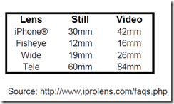
Without going into a full-blown review, which I’m sure you can find elsewhere, the iPro lens system is made up as you can see below, with 3-lenses and a case for the iPhone 4 and 4S which utilises a bayonet mount for each lens. Each lens is of the fixed type and corresponds to 35 focal lengths accordingly for both stills and video:

image

The nice touch is that unused lenses, become part of a lens case and a handle which attaches to a screw attachment on the iPhone case, thereby making a sort of mini monopod as shown in the next picture:

Packaging wise, it came in 2-boxes.  One for the iPhone case with the wide and fish eye lenses and handle, the other holding the telephoto lens.   Setting it up took a few minutes, with care being applied to getting the iPro case onto my 4S. I should add the case fitting is very tight.  Getting it off, was tricky and Schneider Optics should look at this as an area of improvement for their next version.

In terms of usability, beyond the novelty, it was nice.  I found the wide and fish eye lens most fun.  Don’t expect stellar quality as the lens a function of the optical capability of the iPhone 4 and 4 itself and their own glass working with it.  But remember, my aim is not taking stunning detailed RAW images, but photos to add to my cloud service apps and social networks.  To that end, it played nice.  Another improvement I’d like to see is the bayonet fitting for each lens to the case to be less fiddly (as handling miniature and delicate lenses like this open up the accident factor if you’re in an odd place), but as a a solution for getting a better range of photos with my iPhone 4/4S and keeping it as small a possible, this is very good, not not great.

One point of note, is that the iPhone’s flash does not work with the iPro lens, thereby forcing daylight scenario photos and thereby opening up the limitations of the iPhone 4 and 4S low light capabilities to the newly crowned iPhone 5.

An iPhone 5 equivalent set of lenses and case is current under development at Schneider Optics and you can bet it will be available in a number of months, given this iPhone 5 model size should see us to a 5S in about a years time. Attending a friends wedding at the summer enabled me to get a real tour of duty for a day and experience for how practical the iPro lens were to use and assess the quality of the photos.  I liked it, and it is quite a pull in wedding conversations with the “where did you get the cool tech from for your iPhone” sort of line.

If you want better range of fun factor with an iPhone 4 and 4S, the iPro lens is well worth a closer look.

Friday, October 19, 2012

Nearly a month with the iPhone 5

The relationship we have with our smartphones nowadays, like the standard mobile phone before it, is the most important we have in terms of devices running our lives in connectedness with the modern world, western industrialised or not.  Mail and collaboration, productivity, utilities, games, music, video, books and the web itself mark the cornerstones of what has changed in terms of we expect to have since Apple launched the iPhone to great intrigue and derision back in 2007.  For me, and most other smartphone converts in the industrialised world, we’ve not looked back.

My old 4S was a very, very good smartphone, but when I got Google’s Ice Cream Sandwiched Nexus S, I really appreciated and wanted the larger screen in an iOS smartphone.  The question then became when that would happen and would it force Apple to make design trade offs, based on their previous statements that 3.5inch screens were designed optimally for one-handed use.

Ordinarily, I could have and perhaps should have waited since I only had the 4S for seven months.  Problem is, smartphones lose value very quickly as the ante is upped with the latest model.  Losing £200 resale value on an unlocked mint condition unit, happened in an alarmingly short time.  I suspect the larger screen is the main value differentiators in most people’s eyes (like mine).  Most notably, and as we’ll come onto, each iteration of iOS software is designed to work optimally with each new generation of hardware.  What does this mean?  It means that you see signs like seeing how a little bit laggy the Apps Store loads on a 4S and knowing that in a another 12-months, it will may well be the basic entry model and the minimum requirement for iOS 7.0 (though to be honest, I expect the iPhone 4 to still be the very minimum).

So after, a month, was my £200 net cost increase for the same phone (albeit larger) worth it?  I have to look it at that a number of ways.  Let’s take the basics which I have to admit to:

  1. I’m a geek and spend a disproportionate amount of income using, playing and learning technology.  Implicitly this mean a regular nature upgrades of favoured products
  2. I really wanted a 4 inch iOS device to bump up the screen usability compared to what I have on the Galaxy Nexus – which I preferred in screen estate.  Have I said that already?

Of course that does not say in the main what I think of the device, so in predictable fashion here are my bullets:

In your hand use – very light as you will know.  I mean it feels crazy light.  Feels more like a slippery bar of soap than the previous 4/4S.  If you’re prone to drop, get a case immediately.  But do I like, yes.  The taller dimension is actually a better hold in my relatively large hands.

Speed – yes, definitely snappier.  It’s the small things like the Apps Store opening up so much more quickly.  Add to that my son and I opening Football Championship Manager 2012 on the new device for the 1st time and being surprised how much quicker than the 4S it was.  I mean, fast.  Add to that the ICS’d Galaxy Nexus, is starting to feel slow.

Screen – freakishly sharp.  While still Retina display, they’ve enhanced the vividness of the colours, blacks and contrast, which always looked washed out to my the preferred image on the Nexus with its OLED display.  Parity, by my eyes, restored.

Camera – faster.  Much better in low light.  Nuff said.  Photographers rejoice.

Wireless – being in the UK, have yet to early adopt when it comes to Everything Everywhere (T-Mobile and Orange) as the first UK 4G service rolls out imminently.  That said, 3G performance feels quicker possibly due to the CPU, GPU, RAM combo on the new hardware.  5Ghz wireless N is now on board with the new Broadcom chip.  This baby now connects around my home access point at 150Mbps.  Bear in mind the iPad mark I, connects at 65Mbps on 5Ghz wireless N.

Battery – based on my own profile of use, it seems to be less than par with the 4S which is disappointing.  Not a lot, but noticeable.  Check the Ars review on that.

Each iteration of iPhones brings further superlatives. I mean packing that much better tech in a model which is larger (but more miniature inside), lighter and faster.  True Moores Law stuff, Intel must be weeping.  As an end-user with limited appreciation of other smartphones (i.e. 2 previous Android models), the iPhone 5 is stellar.  If you don’t believe me, grab a cup of coffee and read the mind-boggling detail AnandTech goes into in terms of its review.

Wednesday, August 8, 2012

The problem with Airport Networking is that it just works

The often experienced problem with tinkering is that in the process you screw things up and have to figure out how to put all back together again. Of course, it's the process of rebuilding things which leads to new insights and improvements. In this scenario, this was all about Airport home networking tinkering.  The aim of the tinkering was to do 3 things:

  • Maintain a 5Ghz wifi network for all my smartphones, tablets, Macs, Media streamers and Windows PCs
  • Ensure it was a roaming network for each device to pick up the best signal, regardless of where it was being used in the house (3-floors)
  • Get the Airplay playback to Sonos less prone to drop out because it was connected to my 2.4Ghz wifi network

Sonos Airplay

Using the previous version of Airport Utility (5.5.6), it was very easy to add Airplay to Sonos to throw iOS device music at the different Sonos zones. While the wifi radio on the 1st generation Airport Express was turned off, I did configure it to join the 2.4Ghz wifi network running off my Billion router. Playback on the Sonos Airplay was patchy in that it would consistently cut out the signal at various points in the playback of any tracks from my iPhone.  It made no difference for which zone it connected it to and which iDevice I used. I had the same symptom of issue with Rogue Amoeba's Airfoil which I shared previously. Given that Sonos creates it own optimised mesh network to optimally playback wireless music, my suspicion was that this had to do with the Airplay part going over the 2.4Ghz network where throughput is renowned for being choppy, regardless of any channel I chose.

The 5Ghz network
The initial idea was to add 2 Airport Expresses to the 5Ghz network (Airport Extreme – 'AExt') which would add coverage to black spots in the house, due to the shorter ranges covered by the 5Ghz mode.


I set up the first 'AExp' (for the lounge) using the 'extend wireless' option for the main 5Ghz network and it was operating fine.  Issues started to happen when I tried to add another AExp (for the loft) wirelessly in the loft to similarly extend the wireless network. At first, the wireless connection simply would not pick up. After a few soft resets, I managed to get it to pick up via an ethernet connection.  Then I found it was operating the extended wireless network at the 2.4Ghz which went against my aims. I ended up setting up another wireless access point with a different name to ensure I could get the 5Ghz mode which I wanted. Less than ideal.


What I learned from this was a subtle difference between Creating and Extending a wireless network with Airport Utility. While extending is fairly obvious, Airport Utility can actually extend your network by using the Create a Wireless network option. In this instance, the new access point  simply adds new 2.4 and 5ghz channels to the same access point name. In this regard, it optimises the wireless performance of the AExp where it is located, instead of forcibly making it run to the channels of its parent base station.  The result is a change as in the screenshots below. Loft AExp – tick.

Initial set up for additional base stations
- wired and wireless

So I returned to the Lounge AExp and thought it would be relatively easy to change the connection from wireless to wired by simply adding the ethernet cable to the switch where it was located.  What I found was somewhat strange - it seemed to cause a network storm and take down the Internet connection.  Take the ethernet cable out, and in a few seconds, all access points and the internet were back.

I suspected possible causes of this easy repeatable were either IPv6 LAN traffic enabled on the Billion and being automatically picked up on the AExt and AExp's.  So I turned this off and plugged in the ethernet cable again.  All connections went down again.

Then I realised 
 the magic of the Airport products, is that you need to soft reset them and run the Add a new base station routine in Airport Utility. Voila, it worked. 

Throughput wise (and concentrating on 5ghz), it has been beneficial. The rather hidden 'hover over' feature in Airport Utility (Mac) shows solid connection rates for each piece of kit. For example — iPhone at 52Mbps, Galaxy Nexus 39-65Mpbs, Apple TV 3rd gen 65Mpbs, Apple TV 1st gen 162-270Mbps, MacBook Air 162-270Mbps.


Results wise, I have 3 base stations connected by ethernet, using the same access point name across each floor, each with support for 2.4Ghz and 5Ghz support. The only difference between them is the channels being used for 2.4 or 5Ghz modes.  In effect, Airport Utility has optimised their radio signal as per their respective location.

Back to Sonos Airplay
Using the same principle of soft reset to re-run the set up routine for the 1st gen Airport Express, it is also connected by ethernet to my Sonos Play S5 in the lounge, with the wireless turned off.  When I airplay audio from the iPhone or the iPad, it works – flawlessy.

So the final Airport base station network now looks like this.


All ethernet wired base stations
- even Airplay with Sonos, which plays nice!

Morale of the story?  Use ethernet for connecting each base station to your network. Get HomePlugs and Switches if you have to, and while it will cost extra, it makes for a more satisfying device connection and playback performance across the entire network.

A couple of other points of note.  TidBits editor, Glenn Fleishman's video on Airport Utility is a great introduction on the latest how to on Airport Utility.  I go even further and recommend his book available in ePub, Kindle or iBooks which goes into extra detail for running and configuring Airport product networks at home or in the office.  Recommended.


From smartphones to tablets

With more of us consuming our content on smartphones and tablets, our requirements for computing on the go are coming more refined. And our preferences are shifting all the time.

What started as uniform acceptance of 3.5 to 4 inch smartphones is changing. With the success of the Samsung Galaxy range, culminating in the extremely successful S3 and Galaxy Note, it seems Apple has responded competitively and is due to announce a 4inch (16:9) device this September according to trusted bloggers such as iMore and TheLoop. What's interesting for me, is less about the 4S to whatever the new model is going to be called, but seeing if there will be another opportunity to use a more immersive and more portable device to take around with me everywhere.

Like most of us my iPhone or Galaxy Nexus is my primary carry around device largely because driven by the occasional need to make and receive calls. I carry the iPad around for preferred consuming on the train, on flights, in the hotel or even at my desk in the office. It ends up being a strange problem, in that the the the iPad is perfect for web browsing, book reading, RSS feeds and video playback — however, it's not as portable as I'd like it to be. It's too heavy. As such, while suited to the hotel, couch or on your desk in the office, it's not the preferred experience when on the train or when needing to drop something lighter into the bag when you're on the move.

While smartphones by Samsung, Motorola and HTC have been increasing in size, it's the tablet space which I see is going to be more interesting. Many of us have developed tastes and preferences for different types of portable devices when we are on the move, dependent of course on where we will be.  The iPad has redefined what we do on the couch, but it's not ideal for the key things we want to do when on the move, largely due to its current mass and weight. And what is it we are doing when on the move in the main? Our access to the web has been redefined by apps, with the occasional visit to the web. Really you say? Think of mail, RSS feeds, tweets, eBay, video chatting, SIP calls, book reading, movies, TV shows and games. This is where I can see the 7-8" tablet is being readily accepted as the middle of the ground tablet device where another option of portability is required.

Nexus 7 by Asus. Great price, nice features
but lack of 3G is a poor decision

I spent thirty minutes just the other day with the Galaxy Nexus 7. Initial impressions were quite good. It held nicely in one hand, the screen was sharp and bright (although not taking on the Super AMOLED colour vibrancy which I really like on the Galaxy Nexus phone) and it was quick.  It packs some good processor power for the stuff I'm talking about. Of course, optimised tablet apps on Android are sparse, but in time this should change for the better. What struck me as how I think I would prefer to slip a tablet into may bag for my every day commute. I'm suggesting I'd carry this around more than my iPad.

Back to the Nexus 7, the let down was for two fundamental things. Wifi only specification — an odd decision when you think about it. When you want to catch your feeds on the the commute, you can't until you reach the internet. This is a seriously poor decision which will have put off many buyers since access to your cloud data and the web everywhere is where we're at. The second let down was more minor, but yet important — the lack of rear side camera. A glaring miss when we all now expect it.   Some commentators will say these features are reflected in the trade offs for manufacturing cost. It seems to me that v1.0 of this product has a couple of key improvements ahead of v2.

Of course, being heavily invested in iOS and OS X reduces the chances of accessing the data or applications I would want to use on Android, but the shortcomings of the Nexus 7 rule this out for me anyway. This  paves the way for a £200-250 iPad mini (or whatever it's going to be called) in September.

@TrojanKitten beautifully mocks up the expected dimensions of the
forthcoming iPad mini

So believing the rumours for a moment, the 7-8" tablet is going to to be redefined and at a price point which will sell by the proverbial bucket load. However, therein lies the delicate challenge. If you have a device which is portable enough, what happens to the use case for the smartphone itself?

For me, the next piece is then to work out how I don't need an iPhone anymore and can cost effectively manage the low number of voice calls in a neat and subtle on-person microphone sort of way. I can't imagine the major telco's or Apple or any other the hardware vendors looking forward to this.

Friday, August 3, 2012

One for the toolkit – DiskWarrior for the new MacBooks

Since replacing the Macbook recently with the 11.6 Air, I had noticed that beyond the clone backups and the cloud syncing, if the worst should happen with the on board SSD, I'd have no DiskWarrior get out clause.

A quick surf around what Mac users with the no optical drive on the Macs do in this scenario, revealed a relatively straightforward answer which I thought I would share:

  • In this case, use a Mac which does have a SuperDrive on board
  • Insert the DiskWarrior DVD into the SuperDrive
  • Insert a good quality USB key (probably 2-4Gb storage) into the Mac
  • Fire up Disk Utility
  • Format the USB key as 'DiskWarriorDVD' to get it ready
  • Move to the Restore tab
  • Drag the DVD of DiskWarrior to the source field
  • Drag the USB drive of the DiskWarriorDVD to the destination field
  • Click Restore

Simply use DiskWarrior to create a bootable USB key for DiskWarrior
— perfect in the toolkit for the new MacBooks

That's it. Store the USB key somewhere you can remember.  If the worst should happen and the MacBook does not fire up.  Insert the USB key and press and hold Cmd + O until DiskWarrior has fired up.

Toolkit updated :)

Streaming to the big screen

With recent announcements in relation to the availability of Hulu Plus on Apple TV, plus the addition of AirPlay Mirroring for newer Macs on Mountain Lion, it was a good moment to check where I am on options in cutting the cord from satellite TV here in the UK. The essential aim is to be able to access web content on the big screen, ahead of UK based TV schedules.

Of course, BSkyB is very powerful in UK & European market terms, both in its variety, with agreements with TV networks and film studios, alongside their unrivalled ability to content via set top boxes, mobile and even internet subscriptions. All with DRM and related encryption technologies thrown in to boot.

Previously, I had been playing with the Boxee box.  A decent product overall, with key features such as VPN configurability to be able to access US based services such as Vudu to get 1080p movies and film shows. The only downers being in terms of the price per throw for each movie (as opposed to a monthly all you can eat price).  A complimentary entertainment source is Hulu, in the form of the Hulu Plus service, designed for consoles and media streamers with HD content baked right in.  To date, Hulu Plus has not been available on Boxee, and given its niche numbers, I wonder if it ever will be. Without Hulu, Boxee is always missing something which really transform its value for non-US users.

So if you want to get access to your Hulu standard def shows outside of the US and Japan, you turn to the web with a VPN. Enter AirPlay Mirroring. However, Apple enabled AirPlay Mirroring only on their newer Macs, due to performance issues on older ones with the newer requirements of the technology. Thankfully, outside the Mac App Store, there are other solutions.

AirParrot is an app I mentioned previously. I tested it with my 2008 iMac on 2 favoured use cases which matter to me. Namely streaming football via FoxSoccerTV and then of course Hulu. The mirroring was to my 5 year old 37" Panasonic 1080i Plasma TV to check the quality.

AirParrot streamed content from iMac to Panasonic Plasma 1080i set

As you can see from the screen shot, the quality of the stream across the LAN produces a smooth image with much of the anti-aliaising built into the TV signal processing.  Of course, what it distinctly lacks is any real sharpness or detail. But given that the source is standard definition or below web source, this is hardly surprising.

What was even more interesting is how hard the iMac was working, both in terms of packets across the LAN and how heavily the iMac CPU was being taxed.

Courtesy of iStats menus - how the iMac was working hard to
use Airplay over AirParrot
AirParrot can also allow you to extend your desktop while mirroring content.  This provides additional value in terms of being able to watch your footy or TV shows on a mirrored screen while working on your main monitor at the same time.  Seeing how taxing this is on machine resources, I am mindful of the types of apps I'd throw for doing other stuff — e.g no heavy lifting apps such as image processing or CAD drawing.

So where does this leave me?  Well for us non-US dreamers of Hulu on Boxee or Apple TV, we can still use standard definition as we had all along as long as we put our money down on a decent VPN connection.  Of course, I can sign up to Hulu Plus for $8 per month (enabled by having a US Credit Card or PayPal and a bona fide US address) and then stream via AirParrot on the older iMac or use proper Airplay Mirroring fro the MacBook Air to the TV in the lounge.  In that scenario, I would have access to HD quality streams where available on Hulu.  Beyond that, I can only hope that Hulu finally shows up on Boxee.  It's been a long time coming, given its availability on most other console and media streamer platforms, but it would certainly tick all of my key boxes to think seriously about cutting the cord on UK satellite and cable TV services.

Friday, July 27, 2012

Mountain Lion – Adding Value

Lighter, faster, iOSified –  with lots of polish.
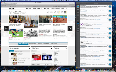
Behold OS X Mountain

With my iMac being a 2008 edition, Mac OS X has had 4 OS upgrades over the last 4 years, going from Leopard, Snow Leopard, Lion and culminating in this weeks release of Mountain Lion.  Windows in this period of time has had Vista and Windows 7, not withstanding service packs.

In terms of day to day experience, Snow Leopard was certainly the memorable release in terms of speed and ease of use between Leopard and Lion. 2011's Lion, I was always troubled with. Slow to start up and generally less than satisfying as an user experience.  I started to think that future demands of the iMac would no longer be up to the task of future OS X releases, due to the sluggish nature of Lion.  Essentially I've been planning an iMac replacement, sporting an SSD in the next 12 months.   

I also wondered if this was justified, since one should be able to get very good mileage from iMacs. Notwithstanding the SSD, which I believe is essential as time moves on, upgrading to Mountain Lion has revealed that Lion's engineering performance was likely to be the source of the problem as much as hardware specs and expectations on my part. With no metrics or benchmark to hand,  Mountain Lion contains a speed bump which is markedly positive and reverts the iMac performance back to the Snow Leopard days. In addition there are 2 other things which are stand-out of this release for me

Safari – this was surprise. It now has the Chrome-like omnibar and it's damn fast. I mean faster than Chrome. Yes, I said that.  It's also more likely to be more stable and less memory leaky or be the cause of white screen crashes. And that's with Flash still enabled. With Xmarks to keep by bookmarks in tow, Chrome has just been overthrown.  I didn't see that one coming.

Airplay Mirroring – restricted to my 2011 Macbook Air, I can finally stream FoxSocerTV and Hulu to the big screen (I've given up on it ever coming to Boxee).  And I've been pleasantly surprised, the scaling on Airplay mirroring to my Sony flat screen looks nice and is perfectly watchable.  Not HD, but decent quality watchable.  Of course, AirParrot has been around for a number of months and replicates the Airplay mirroring feature for pre 2011 Macs of all sizes.  Using AirParrot, my iMac does take quite a performance hit on the CPU, due to the lack of support in the then ATI graphics chip GPU for encoding and scaling which is of course is now built into the Sandy and Ivy Bridge processors of latest Mac lines. 

Beyond that, I'm ignoring all the other useful features such as Notification Centre, iCloud support, Gatekeeper security and integrated sharing with Twitter for  most OSX updated apps added to all the other iOSification touches. But you can read that across the dozens of other great mainstream reviews like this one at Ars.  

All this for £13 ($20). Now that is what I call added value.


A Jelly Bean surprise

A couple of weeks ago I got a welcome surprise on my unlocked Galaxy Nexus. The over-the-air Jelly Bean (Android 4.1 OS) update had come through. At 144Mb in size, it had already downloaded on the home network and was ready to install.

It was all very straightforward and within 5-10 minutes it had installed and checked through the 100 or so apps installed on the Nexus for optimisation to get up and running.

Jelly Bean add some nice polish
to the Android mobile OS
As I've previously posted, I rather liked the Galaxy Nexus and Ice Cream Sandwich (Android 4.0). In fact, I like it a lot and use it daily. With Jelly Bean, it's not so much about new functionality, it's a smoother and faster experience overall.  The 'Project Butter' set of enhancements have definitely improved the scrolling, sharper imagery, orientation changing and general polish of the device and software. The damn thing just feels nicer and perceptibly quicker — a good example where Chrome is loading pages from links.

The more apps you install, the more you notice the number of updates coming through. A number of them have been Jelly Bean optimisations to resolve minor glitches which you may notice on the odd application.

Wi-fi performance in terms of signal bar strength and consistency is also improved, given a volume of feedback on the Android support forums and my own experience which lead me to set it up on a 5Ghz network.  I now consistently get 50-65Mbps performance around the house. The feature I've yet to explore in any depth is Google Now, but the basic testing voice based searching is accurate and fast. A post on that will follow in due course.

The morale of the story for me, is purchasing a pure Google stock device, not tied to any telco.  How long will Samsung or HTC skinned Android models need to wait before Jelly Bean come to these devices?  If you want to get into Android and not stuck to an old OS, this is the way to go.

I'm looking forward to the new iPhone — as the competition has really caught up and has made innovative strides in areas which are better than iOS (think task manager).


Wednesday, July 11, 2012

Tweetbot for Mac

Tweetbof for Mac -
the best twitter client available


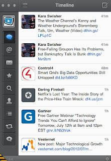
Today, those great guys at Tapbots released a public alpha for the incredibly popular Tweetbots for Mac. While I've enjoyed using Osfoora and particularly its ability to run separate accounts in different windows, Tweetbot has already bumped it from daily use. Seamless, unified execution across iPhone, iPad and Mac.


Sunday, July 8, 2012

Home maintenance

In the last few months, I'd noticed an increasing number of system freezes on my iMac 24 from late 2008. As you will all know, these sorts of things feel generally random and happen at the wrong time when producing or creating something - so they are especially annoying.

The odd one every few months is okay, but in recent weeks web browsing, on-line gaming with Football Championship Manager or editing in iBooks has seen a frequency of freezes get to the stage of being particularly troublesome and worrying. My overall aim for the iMac 24 is to see it through the next 12 months into 2013 (dreams of a retina display iMac + SSD). This summer it will see its fourth OS upgrade in the form of Moutain Lion, and the Mac will probably be a a bit slower again as  result.

Wondering if something was up, it was time to run the key checks on the disk and other subsystems. In terms of quick checks, I did the usual repair permissions with Disk Utility.  But another freeze occurred afterwards,which suggested to me with all the spate of freezes which required power recycling, I'd need to do a directory rebuild using DiskWarrior.   Since doing that, the iMac has felt a bit snappier.

DiskWarrior is an essential utility and well worth the investment

I also took the opportunity to upgrade TechTool Deluxe which came with AppleCare to TechTool Pro 6, which now provides a range of background preventative monitoring tasks as well as range of test across al subsystems across the machine (disk, memory video memory,etc).  It's certainly a comprehenisive tool and again another one worth the considered investment in self-maintenance before calling for the vendor repair option.


TechTool Pro 6 is a worthy tool for a wider range of tests
So far, so good. Beyond, some directory damage to some minor directories, all looks good.  From a browsing standpoint, I decided to disable Flash on Chrome and leave it available on Safari when I do need to watch Flash based content.  It's good to know that HTML5 video has come on leaps and bounds as the preferred video content standard since the advent of iOS and Android devices.

So, time will tell if this has made the difference and if I'm sitting on a major hardware failure. While a disk verification runs in my scripted SuperDuper backup clones of my hard drive on a monthly basis, I think a quarterly directory rebuild in DiskWarrior is the task I'll add to my schedule from now on.

Sunday, July 1, 2012

MoneyWiz, the personal finance app I've always wanted?

Yup, I'm a geek enough to like to locally manage my finances across my portfolio.  As a corporate manager responsible for a significant budget for services and daily operations, apps like these are where I've learned the trade of watching and predicting where the precious pennies will end up and taking corrective action before the bank realises something's up ;-)

Going back a number of years, when I was a daily Windows guy, MS Money was the staple of champions (well that and Quicken). It allowed 'my types' to input or import transactions from on-line accounts which supported MS Money, do reconciliations and run reports to see trends and pattens and take action in real life.  They also have basic investment portfolio trackers which were okay for general use.

Since going Mac about six years ago, running MS Money on a virtual machine (vm) was a bit of a pain, for the obvious reasons of having  to open a memory intensive vm to run a personal finance app.  Added to which trying to share the data across Dropbox to another vm on my Macbook just didn't work. In the end, I was forced out of MS Money for the sheer reason of moving the vm and therefore MS Money to Windows 7 and it was no longer on the compatibility list once Microsoft had withdrawn support.

Next up was Jumsoft Money for Mac and iOS.  Importing account transactions from MS Money was a no-no, since it produced some erratic results and essentially did not work. It was a painful evening once I stopped MS Money to get set up everything up (accounts, recent transactions, scheduled transactions, reports) in Jumsoft Money and to get efficient with the user interface and overall experience. It was good, but not great.

Beyond being a native Mac app, the other benefit was for the first time being able to do updates on the move to the iPhone or iPad version and do local wifi sync to the desktop application. You would think I'd be happy, but the syncing would from time to time not work, coupled with the iPad version being removed by Jumsoft and prompting me to upgrade (£) to another version of Jumsoft Money. There was always the issue of being tied to syncing between the iOS device and the physical home machine, which after a while became restricting. A few conversations with support around Dropbox support for multiple Macs leading nowhere lead to a level if distrust with the developers and where they were headed with the roadmap. I've continued to use Jumsoft Money for the last 2 years.

MoneyWiz - made a good start..time will tell..


A couple of months ago, I saw a new app on the block: MoneyWiz. It seemed to get a higher than normal 5 star ratings on the Apps Store and I was intrigued. Most importantly, it featured a separate cloud sync option which all iOS and Mac instances talked to. I could have my cake and finally eat it for a personal finance program.

Importing data from Jumsoft Money was relatively straightforward and at more than 90% success, imported cleanly into MoneyWiz. There are some categories which need removal of duplicates due to the number of account imports I did, but on the whole, I was up and running almost immediately. First time sync to their cloud (which is based on email & password set up) takes a bit time, dependent on the number of transactions to process, but it does work. I often wonder  what sort of infrastructure and hosting is in their cloud, but on the whole it works and if the cloud is not there, I'm able to work locally anyway.

The interface is well designed and intuitive to follow. Not too many shortcoming, although I'd like to know more on the cloud sync particularly from a security perspective (is the transmission over SSL, is the cloud storage encrypted, etc).  I'm using it side by side with Jumsoft Money, having not decided to make the clean break yet. Time will tell.

If you want to get a closer look at the features of MoneyWiz, MacStories ran a useful post a a while back.  I certainly think it's worth a closer look.


Getting Things Done – Using OmniFocus

Being an advocate of the Getting Things Done GTD approach to work by Dave Allen, smartphones, tablets and PCs are great ways to use tools to keep on top of what I do on a daily basis.

At work and using the your corporate desktop image based on Windows 7, this is primarily achieved by using ToDo functionality in my mail client calendar.  The key to managing stuff is in terms of:

  • Capturing and updating on items of works as you get through the day in new to dos
  • Having a simple level of prioritisation, which should involve:
  • Spending greatest time on items which add real value and deliver things
  • Ensuring you're on top of the items which can bite you (pissing off wrong influencers/decision makers)
  • Disciplining yourself to a habit of evaluating the list of GTDs at the end of each day

For me and not saying I adhere to every aspect to the GTD methodology, it work well enough, given the limitations of tools. From an outside of work perspective, I get to put this into practice with the tools I want to use. As I use a phone, tablet and PC - the key value differentiator is finding the piece of software which allows me to use across all devices and allow cloud syncing wherever I am.

Now in answering the question of what tools in the personal life space, I have a number of scenarios to cater for:

  • Quickly capturing something and pin a target date on it. (A simple description and date). In this space, I use Due for iOS and Mac
  • Capturing a more fully formed ToDo which is part of a aspect of my life and a theme important to me (say blogging, learning or doing something creative)
  • Grabbing notes and thoughts just to dump them and have a place of record which I can go back to use. Of course, Evernote is the stand out app and extends also to Android.  I use this approach a lot at Seminars and Conferences
  • Anything I capture on the web to go back to read and possibly use in the future. Instapaper is still king for me. It recently became available on Android.

OmniFocus for iPad - my daily staple
For a number of months now, I've been using OmniFocus across the iPhone, iPad and Mac for the fully formed ToDo stuff. Of all the solutions out there, OmniFocus ticks all the boxes in terms of how I wanted to work and with a reputed solution which others had tried and tested. It's the most expensive with individually priced apps across both iOS devices as well as the additional cost of an OSX version. But, in terms of value, it's been an excellent companion and hugely reliable to date. David Sparks' recent review at Macworld highlights the good areas as well as its downsides.

What's most interesting in my experience here is how I actually prefer the iOS touch  interface to OSX, which I find clunky, cumbersome and visually unappealing. In fact, most captures and updates are done on the wonderful iPad version, which as you would know, forms the mainstay of my daily experience outside of the office. The only downside, is that it's not on Android, and neither does it look like it ever will be.

The other solution I had invested in is Things for iPhone, iPad and Mac. At the time of writing, the cloud sync version is still in Beta (I have the wifi sync version at the moment), which I'll post about as soon as its out of beta.  The UI on Things is deceptively simple across all platform and it had been a design award winner at WWDC a few years ago. That said, not much has been added in terms of functionality and the cloud sync version seems to have been in development for what feels like forever. Not a good sign.


Finally....yes, I know, I could use one software solution for most of my needs. But I'm a geek and where's the fun in that?


Tuesday, June 26, 2012

When upgrades seem like downgrades

I've been a big fan of of the Silvio Rizzi's Reeder for iPhone, iPad & Mac for what feels like ages now. It's one of my core and most often used apps for catching up with tech and sports news on a daily basis. I'll admint, I'm an RSS guy and I'm proud. Don't get me wrong, I love curated feed apps such as Flipboard and Zite which add tremendous value to the reading experience.  But when it comes to really scanning all your news items, it's got to be an RSS reader. Reeder's interface and experience reveals a clean, functional and Mac simple-like experience in reading and sharing news feeds. It achieves a uniform experience this across the entire iOS and Mac range which is a rare feat. It's an app I wish existed on Android (although gReader Pro is very good in its own right).

The iPhone version is what I use most while on the move. Up to version 2.x it offered a quick way to read news but to share with Instapaper and most importantly Twitter followers, using my custom URL which is I set up on bit.ly.  Real nice bit of flexibility.

I've had version 3.x running for probably for 2 weeks, and while this post is not there to overly criticize the developer (who does a great job and is clearly thinking of evolving the product), the new version has left me somewhat disgruntled in terms of the overall balance of gains in new functionality versus ones which have been changed or upgraded for that matter. My main grips fall into 2 areas affecting functionality and user experience.

The functionality gripe is simple. The bit.ly support for custom URL sharing in Twitter is gone (at least for now). And the custom Twitter messaging has been replaced by the generic iOS Twitter integration dialogue:

Reeder v3.0 for iPhone - sharing to Twitter.
No visible shortened link
and no way to do it
The other odd grip relates to the design led animation to move from one article to another. It essentially mimicks moving from one piece of paper to another as if they were joined together. It's an interesting touch, but not to my liking. Again, the sort of thing which for some of us, takes away from the overall experience and enables us to moan that v3 feels like a backward step in places. You only need to look at some of the review on the Apps Store to see that I'm not alone.  

Anyway, if you are new to Reeder and have always wondered if its worth the 3 bucks (separately for iOS devices and Mac), there are other posts which provided a more rounded introduction than my moans.  I mean, I still use it daily, so that's saying something about the competition.

Saturday, June 9, 2012

Galaxy Nexus — Android Reloaded

Galaxy Nexus home screen
Up to recently, my only foray into owning an Android based smartphone had been the 2010 launched HTC Desire HD. This phone competed with both the iPhone 4 and the Samsung Galaxy S2. Beyond the original must tinker and personalise the device exactly as I want it mode, I found Android experience a relatively poor one. The screen was LCD and did not have the AMOLED sharpness and colour saturation so that video streams looked poor.  The battery was poor out of the box and required lots of notifications and tasks turned off just to get it through the day. It had 3 firmware update for Gingerbread, which made is progressively faster and more stable. This was important since HTCs add their UI in the form of HTC Sense, which is okay, but not great. Since 2010, it seems telling that from going from a large scale manufacturer of Android and Windows mobile devices, HTC are on a downward spiral.

Overall, with very few apps I really liked and could sync data easily with the Macs, performance which got slower over time (especially as I upgraded from iPhone 4 to 4S), I felt I had made the wrong call with Android. To that end, when the pure Ice Cream Sandwich Galaxy Nexus from Google came out in late 2011, I got interested in taking another look. This post is talking about what's broadly happened since I got it.

Light phone, good screen
The phone is surprisingly light and retains a good feel at 135g.  Build quality is affected by use of plastic for the outer case, but nothing that a thin, lightweight and grippable case cannot enhance. The screen is bigger at 4.65 inches diagonal, and resolution is at 1280 x 720 pixels with a PPI of  316. So not Retina, but not too far off either. The AMOLED screen type shows up warmer and more deeper colours and for me, more preferable images than the iPhone 4S (I did a side by side comparison using apps such as Fancy and Instagram). The iPhone 4S are whiter and in terms of contrast, but the overal image of the Nexus seems deeper and more natural. The battery has greater capacity than my previous HTC, and lasts through the day on a single charge while tinkering with it a lot throughout the day (this is not the same as playing videos, games or making lots of calls). And that's without changing anything out of the box. Lastly, with no actual hardware buttons this seems a shrewd move by Google as the back, home and task switcher buttons are now touch operated and change also with the screen orientation. Usability wise, I liked this, nice touch.

It's better in ICS
Using the Nexus from a software standpoint, dare I say it, is pleasant and quite enjoyable. I won't go into all the features in ICS, but of the notable things:

  • Design and polish of ICS is markedly better in an Android way
  • Animations and user experience is a lot smoother (for example, switching between home screens, task switching). In fact, it makes iOS look cumbersome and it need of an overhaul.
  • Much better keyboard, has better spacing for fast typing - feels as good as iPhone
  • Creating and editing groups on the home pages is easy, in fact changing them is easier than iOS
  • You can integrate your VoIP number into the main phone app, thereby choosing between a mobile call and an internet call - actually useful!
  • Chrome is now on Android (download from the Store) - quick and you already know how to use it.  Most importantly, it brings across your Bookmarks from your gmail set up
  • You can now easily take screenshots - through an iOS-like 2-button combination

Overall, this is a more mature version of Android. iOS has a real rival if we do without the Sense's or Touchwiz's of this world.

Apps still are my gripe
Of course, combine the hardware and the base software and in this case, you have a very capable smartphone. However, developer ecosystems are what really drive the platform in terms of its range, value and maturity. If you're like me, you've probably invested  considerable time, money and emotion on apps in the OSX and iOS world, some of which are simply not available in Android. Based on my own requirements, apps like Reeder, TweetBot, OmniFocus, Due, Jumsoft Money, MoneyWiz and Due are some of the ones I cannot do without if I was ever considering a switch. There are others which are available and make the thinking of a switch more of a margin call.  They include include Evernote, Instapaper, The Times, The Guardian, Amazon, Ebay.

When I first started writing this section, I was convinced that rather like my HTC and Gingerbread experience, I'd be bemoaning both the range and quality of such key apps. I expected to moan about the design, UI and overall experience.  The problem is, I've been forced to re-evaluate this position. In many cases, running the iOS5 and ICS versions in a side by side comparison, revealed how the quality of Android apps have improved to the point of being consistently comparable to their iOS counterpart.  Take Facebook, Google+, Zite, ZeeBox and Fancy examples.  Sure, in some cases and I'm looking at Amazon and eBay, they appear like cheap cousins of the iOS brethren, but in the main, I was surprised how much Google and Developer effort has improved the overall Android app experience, especially on this handset.  Of course, for those apps which are not on Android, you get to look up and find good alternatives. gReader Pro, TweetCaster as very usable counterparts to Reeder and TweetBot. Not as good, but certainly a solid experience.

Wifi oddities
One thing stood out, which I did need to do some checking on. Connecting to my Billion router access point, was for unexplained reasons, poor. The first sign was Speedtest.net would drop out ('Communication Failures') from time to time, which would happen even if I was beside the router. Given this is a 55mbit fibre line, picking up 6mbit is kinda suspect. You can do some digging around the various forums to find similarly reported experience from other Nexus users. It seems some sort of issue between the Broadcom chip and ICS where the signal dependent on the access point being used, is prone to drop out. Having said that, it seems to perform better on the Airport Extreme access point at 2.4Ghz, registering 25-30mbit download speeds consistently. The 5Ghz access point did not picking up, even through the Broadcom chip should pick up the 5Ghz as a preference.

Other bits
Apps and Wifi  aside, other things I picked up were minor. For example, text height is taller on the Nexus, probably because of the screen size and aspect ratio. Given the growing evidence of a 4 inch iPhone screen in the forthcoming iPhone 5, I hope Apple do not also fall into the trap of the taller text to accommodate screen sizes and aspect ratios, as I like its overall appearance. There are other UI idiosyncrasies with ICS, like the inconsistent appearance of the settings/options panel, but as I said these are minor to be fair, do not detract from the overall positive impression I've had using the Nexus and ICS.

ICS is a real step up
I really like the Nexus and ICS. I've been reaching for it a lot. It's easy to pick up and easy to use if you are familiar with Android. It's fast, and is directly comparable to iPhone 4S snappiness in use. I really like the screen and surprised as I am in saying this, I prefer the colour tones to the 4S. The 4.65inch screen is too large to do everything in one hand, but while it's not perfect, I'm find it useful to have the larger screen estate when using specific apps.

I hope apps continue to improve in UI and overall polish. If they can continue to bridge more popular iOS apps such as Flipboard (which is currently an exclusive for the Galaxy S3, but will be on general release soon), then this brings iOS devotees like me, closer to having a harder choice. And did I say using this phone and software is seriously quick?

I think is that it's important to understand that Google while copying Apple and iOS, seems to be on its own path in terms of design and the Google brand. This is good to see, and I'm looking forward to the next software release. Especially as a pure Google handset, as I'm free of the shackles of telco's, and their add-on interfaces.

Would I recommend this Galaxy Nexus? Absolutely. An iPhone 4S replacement? Not for me, but I like the fact that the gap is closing. We just need to see more support for Android from the major developers on iOS. Of course, the drivers and reasons for this to happen is a whole other discussion.


Tuesday, May 22, 2012

Getting into home automation — II

My previous post, focused on some achievable targets in terms of monitoring and controlling devices plugged into the mains around the home. This post is the one which gets me excited — how to watch or game on any rooms which has a display in the house, via a universal interface which all the family can use.

Being able to watch the Boxee box, Apple TV (1st and 3rd gen), Sky+ HD or the Blu-ray in the other rooms around the house would be useful. Similarly, being able to game on the Xbox or the PS3 in different rooms offers flexibility for my family when we have guests and we need to give the kids different rooms where to hang out. It's also seriously good geeking project.

Saving you the long spiel in terms of what I've explored, this post focuses on the solutions now available, supported by relatively new standards and products which require quite a big investment (at least for my pocket) to make this happen. But first, let's zero in on what I'm trying to do here. There are 3 outcomes:


Centralise all equipment in one place. 
Simplify all rooms to a single display. 
Use common interface to access music, films, energy monitoring, lighting, climate control.


Seeing that I have up to 8 devices and 3 TVs in our family home, the first challenge was to understand what was achievable and how it is best organised to deliver multi-room AV. There are 2 aspects to this and Fig 1 brings this to life:

Fig 1 - 8x8 HDMI Matrix Switcher using HDBaseT Single Wire taken from the UK HD Connectivity site


HDMI Matrix Switchers
The first part is what all the HD devices connect to and then what can be pushed to one or more displays around the home. This is the switching device.  It has 2 parts to it a) control of the device via a mounted IR point attached to the source, through the matrix switcher and then onto the display itself.  It allows us to natively use the remote control even though the device is not present in that room.  The other part is b) feeding the HD source via conversion from HDMI to Cat5e/6 through the matrix switcher and out to the display itself via a HDMI/Cat5e/6 extender unit.

More recently, the multi-room AV market has been evolving from simple HDMI switching units to HDMI over Cat5/6 to now HDMI over HDBaseT as a platform. Over time, the evolution of the matrix switcher has overcome challenges in terms of HDMI cable length, signal loss/degradation and auto-adaptation to the display(s) being driven. The end result as shown in the Fig 1 is that each device feeds into a suitable equipped switching unit which has a HDMI in/out, IR in/out and Cat5e/6 out to each display panel. The more HD inputs in, drives the size of matrix switcher your need.  In my case, it gets to an 8x8 which is a beast of a unit (and expensive).

When I first looked into multi-room AV, my thinking was that each source could be left in its original room and I could connect everything on a point to point basis via a centrally located switch. I quickly realised this would be inefficient and a mess to manage.  This ended up changing my thinking in terms of where I put it, how the matrix switcher would be wired to all the HD sources and how neatly I can hide it out of the way. Yep, you got it – it would work best, be more efficient and be easy to maintain and support if I centralised the sources and switcher into one main rack (hidden from the family of course).

User Interface
Of course, to tie this all together in a neat and easy way, I wanted a Sonos like way to manage it all and of course, using an iPad or an iPhone. After a number of discussions with my local hi-fi dealer (Musical Images – hat tip), Control4 came up as the platform of choice, which could meet my requirements. Reading up on them, reveals quite an established organisation who built up out the commercial market, are a leading vendor for residential home automation in terms of multi-room AV, Lighting and Climate control.  Their wireless control of historically uses the Zigbee wireless mesh design as opposed to Z-Wave, although the platform has an extensible part to it, in which drivers from other hardware vendors can be written to integrate into Control4.  My discussions concluded that their premier controller would fit my needs. Going through an authorised dealer network (registered most likely with CEDIA) would ensure the design, installation and support of a Control4 installation. They also take care of the requirements of the matrix switcher alongside all other elements in the requirement and design phase.

And of course, to use Control4 on iOS, there is a license cost which are delivered on a site or single device basis.

How does it actually work?
While you can leave this all to a dealer, with all the inputs involved, I needed to get my head around how it actually works. I subsequently broke it down to this:
  1. Master controller (say the HC-800) links into Router and Wifi network (Node 0)
  2. Master controller is wired to HDMI Matrix switcher via Ethernet
  3. Master controller creates new home mesh network for Control4 aware devices
  4. Matrix Switch is also connected to each source device using IR
  5. Each TV display also has an IR connected back to the matrix switcher
  6. Each TV receives the converted Cat5/6 signal via the HDMI Ethernet Extender which is located close to the TV itself
  7. The Control4 Software is programmed to replicate each native remote control of your source devices
  8. Each device receives command by IR  
Fig 2 plays this out nicely using the single ethernet cable standard with HDBaseT

Fig 2 - Matrix Switcher using HDBaseT and a Control System such as Control4, taken from the Wyrestorm site

If any of you are experts in this area, then bear with me, I'm learning some of this stuff for the first time.  Any corrections or suggested changes are appreciated to make this clearer for anyone else reading this post.

There is also a really insightful Official Control4 forum where users and dealers exchange and share knowledge on installation, tips and support. You can glean a lot from here. Don't you just love the power or the web for collaboration :)

So, to achieve my objectives at least for an intial phase of getting my AV sorted, how much would this set me back? Up to £13k using the Control4 plus HDBaseT type switchers alongside racking, cabling, software licenses and design and installation from a Control4 dealer. Throw in a UPS and that's just the set up cost. I still need to figure out what the annual charges for maintaining this sort of environment would be.

I suspect there are some challenges with this set up. For example, can you really game with Xbox and PS3 with controllers over IR?  This may not work. However, the beauty of this platform is that is very flexible.  Adding in Lighting and Climate control through devices such Nest is all doable with Control4 being a platform where drivers are written for it. One of the other requirements I have is around energy monitoring with real time cost displays which again looks very doable with the requisite investment.

While the missus likes the idea of a de-cluttered equipment across the rooms and an easy to use way of access all the entertainment in a familiar way, think there a more challenging issue of selling this idea off the back of a new kitchen extension. I'll keep you posted on how this one develops :)